

UI/UX & Product Design
Product design that engineers can build from — design systems, conversion-focused flows, and interfaces specified to the pixel and the edge case. The fast way in is the UX & Conversion Review: a fixed-price teardown of your key funnels by a business-marketing pair and an engineer, ending in a prioritised action plan.
Not sure a paid review fits yet? The free 30-minute session looks at one screen or funnel together and tells you honestly whether design is your bottleneck. You keep the notes either way.
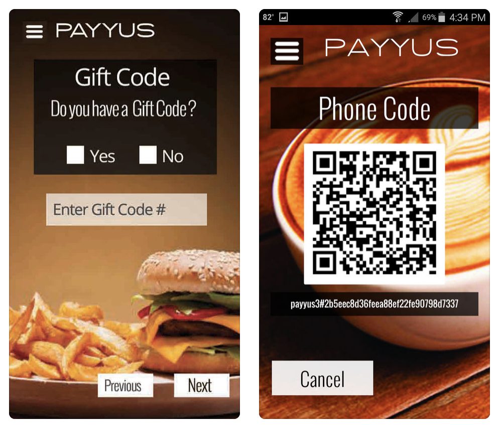
Where design is quietly costing you
Traffic arrives; signups do not
The ads work, the landing page gets visits, and the funnel leaks somewhere between arrival and payment. Every step loses a percentage nobody has measured. A conversion review is the cheapest engineering you can buy: the users are already there.
The product grew screens faster than sense
Features shipped for three years; each brought its own buttons, spacing and colors. New users call it confusing, new designers call it unfixable, and every new feature costs extra because nothing is reusable. The fix has a name: a design system.
Designs arrive that engineers cannot build
Beautiful mockups, missing states: loading, empty, error, overflow, mobile keyboard. Engineers improvise the gaps, the product ships inconsistent, and the designer wonders what happened. We design with the edge cases in the file — because we also build.
AI made screens cheap and judgment expensive
Anyone can generate a plausible interface now. What still separates products is the judgment layer: which flow earns trust, where friction belongs on purpose, what the brand feels like at 9 a.m. in a hurry. That layer is the work.

A global retail brand taught us the bar: a difficult brief, delivered on time and on budget, with the review to show for it.
What we design
The UX & Conversion Review
Your key funnels torn down by two lenses at once — business/marketing (3 hours) and engineering (2 hours): messaging, friction, trust signals, speed, and the technical causes behind them.
You get: annotated findings and an action plan ranked by conversion impact, then a 30-minute call to walk it.
Product and feature design
Flows, wireframes and high-fidelity screens with every state specified — loading, empty, error, edge — so engineering builds instead of guessing.
You get: build-ready designs, with the reasoning documented.
Design systems
Tokens, components and usage rules that make the tenth feature cheaper than the first, in Figma and in code.
You get: a living system your team ships from, not a style-guide PDF.
Design for AI-era products
Interfaces for agents, assistants and generated content — streaming states, confidence display, human-handoff moments — patterns we ship in our own AI products.
You get: AI interaction patterns proven in production, not borrowed from screenshots.
How it works
Review or brief
Existing product: the paid review runs first and finds the leaks. New build: a short discovery lands the brief, users and success metric in writing.
Flows before pixels
The skeleton first — steps, decisions, failure paths — argued cheaply at low fidelity.
High fidelity with all states
Screens with every state present, on the design system, reviewed with the engineers who will build them.
Ship and measure
Design QA during the build, then the conversion numbers read honestly against the baseline.
The cheapest place to fix a product is the flow diagram. We argue there first, at low fidelity, before a pixel is polished.
Proof, not claims
Design proof is shipped product — including a name you know.
A data-heavy platform made navigable
Real-estate operations with serious information density — the design problem is hierarchy and speed of use, and it was solved in the shipped product, not the deck.
UX work for a global retail brand
A UX improvement engagement for Westfield — a difficult brief, delivered on time and on budget, with the verified review below.
The UX & Conversion Review spends up to 5 hours — 3 from business and marketing, 2 from engineering — and ends in an action plan ranked by conversion impact.
“Really great to have worked with Anton and Georgiy. They understood a difficult brief and delivered everything professionally, on time and on budget. I hope we have the opportunity to work together again soon.”

Design decisions, defended with numbers.
Start with the UX & Conversion Review
UX & Conversion Review
Up to 5 hours on your key funnels — 3 from a business and marketing lens, 2 from engineering — because conversion problems are rarely just visual. The flow: access and goals call, the review itself, a prioritised action plan, a 30-minute call to discuss what is worth doing at what effort, then the final report.
- Access & goals call to frame the funnels that matter
- Business/marketing review: messaging, friction, trust, pricing presentation (3h)
- Engineering review: speed, errors, mobile behaviour, technical causes (2h)
- Prioritised action plan, ranked by conversion impact vs effort
- 30-minute discussion call + final report with the plan
Up to 5 hours of senior review; findings and the action plan in writing.
Pay online and the access & goals call is scheduled the same business day. The action plan is yours to implement with any team — including ours.
Clients also buy
Full-Stack Web Development
Web products built end to end by senior, AI-tooled engineers — with quality you can verify, not take on faith.
E-commerce Development
Development and optimization of running stores — speed, checkout, payments, integrations and migrations that protect revenue.
Product & Technology Consultation
Cost, stack and roadmap for your app — before you build. A paid session plus a written blueprint, bookable online.
Every screen is a salesperson. The review measures how well yours are closing — and tells you which one to coach first.
The questions buyers actually ask
What exactly does the UX & Conversion Review cover?
Your key funnels — landing to signup, browse to checkout, trial to paid — reviewed through two lenses: business and marketing (messaging, friction, trust signals) and engineering (speed, errors, mobile behaviour). Findings arrive as a prioritised action plan with a 30-minute call to discuss effort, cost and sequencing.
Why is an engineer part of a design review?
Because a third of conversion problems are technical wearing a design costume: a slow step, a failing validation, a mobile keyboard covering the button. A review without engineering eyes finds the cosmetic half and misses the expensive half.
Do you redesign, or just report?
The review ends in an action plan you own — implementable by any team. If you want us to execute it, design and build continue as a scoped engagement with the same people who wrote the plan.
Can you work inside our existing brand and design tools?
Yes — we work in Figma, extend existing design systems rather than replacing them, and match the brand you have unless changing it is explicitly the brief.
Do you design mobile apps as well as web?
Both, including the platform-specific patterns each store expects — we design and build iOS and Android products, so the designs arrive buildable.
What does full product design cost after the review?
Scoped in writing per engagement — the review’s action plan gives both sides a precise basis for that number, which is one more reason to start there.
Seven ways to get software built well — the one-page version
The Build & Design services on one printable page: what each covers, when it is the right door, and what the first deliverable looks like. Built to be forwarded to whoever holds the budget.
Find the leak, then fix it
Checkout takes two minutes, and the kickoff scheduling email arrives the same business day — the engagement starts this week, not this quarter. Want a human first? The free 30-minute call higher on this page is exactly that.